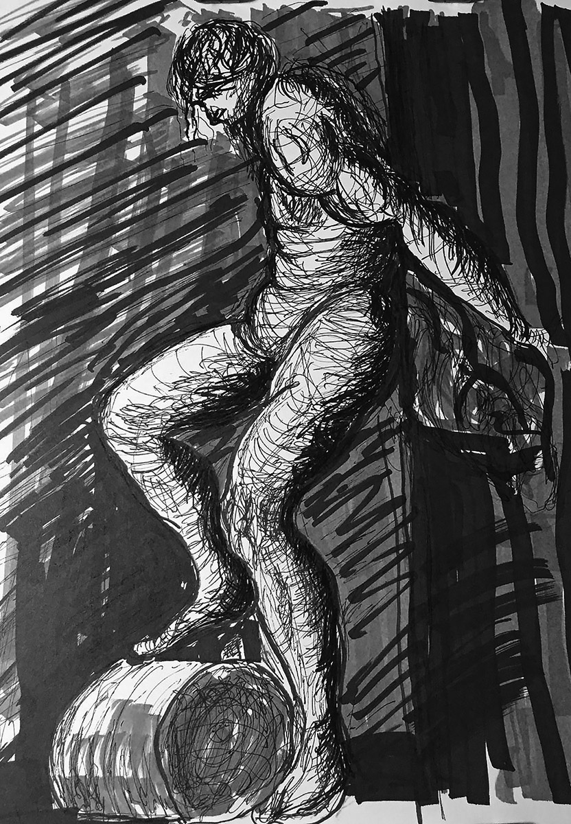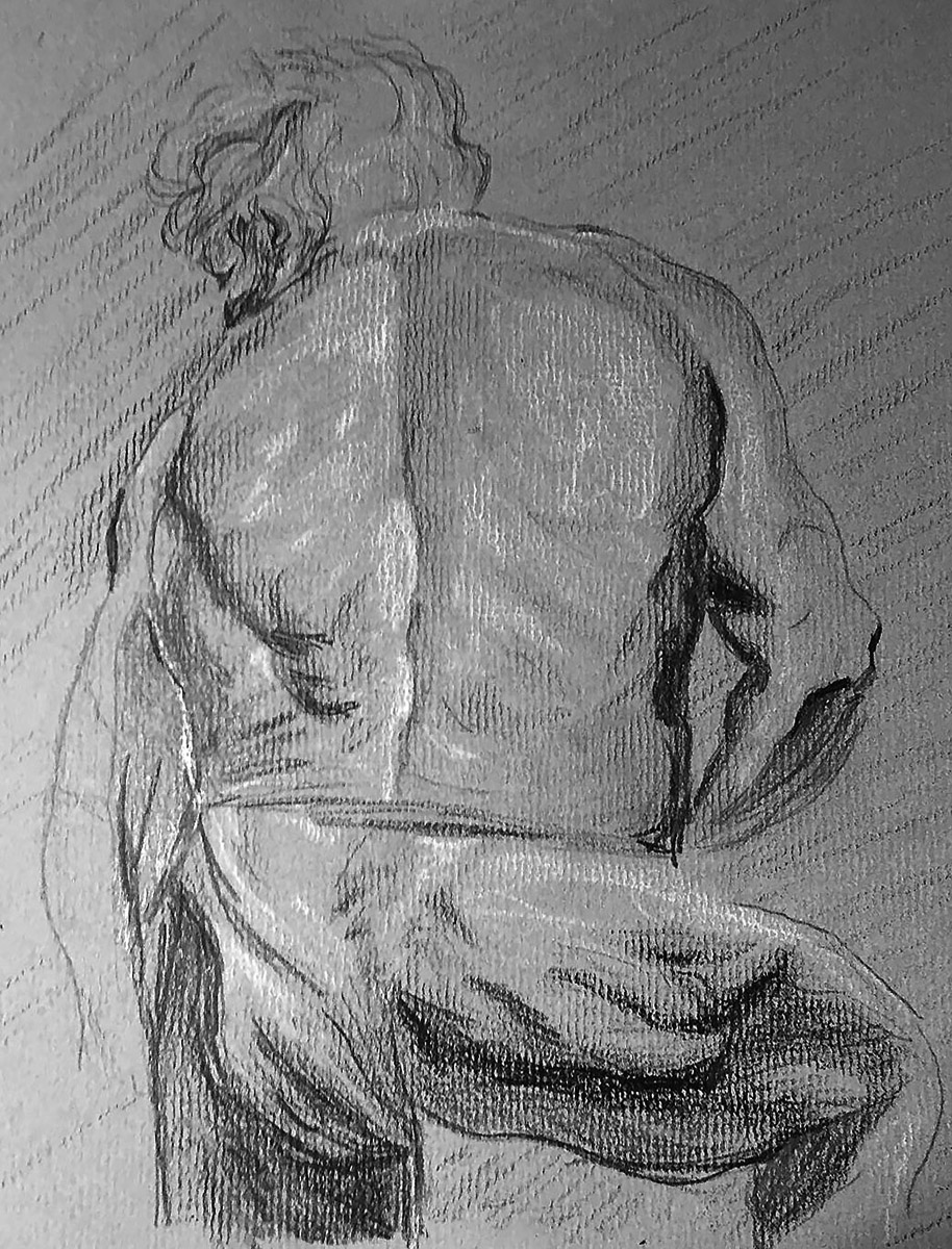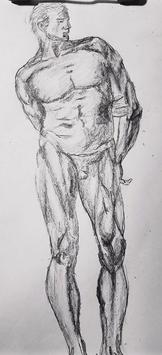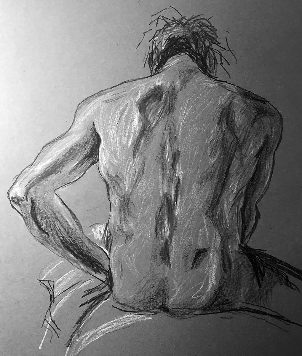
My next offering is a drawing done with black and white Prismacolor brand pencils and sticks on gray toned paper. It is a copy of a drawing done in chalk on blue tinted paper by the Venice master, Giovanni Battista Tiepolo. That drawing, completed in 1751, is in the Staatsgallerie in Stuttgart, Germany. Tiepolo’s drawing is titled “Nude Study: The Back of a Seated Man with a Crown of Reed”. I originally thought the reed crown was his hair. I was planning to make several jokes about the model having a bad hair day or maybe make a dig at Supercuts. So without that material to work from, I’ll have to get somewhat serious, as serious as I can be, about the great Tiepolo. Giovanni Battista Tiepolo, or Giambattista as he was often called was born on March 5, 1696, in Venice, Italy. Not Venice, California.
“I originally thought the reed crown was his hair.”
Speaking of Venice, California, when I was going to college at San Diego State University, I took a road trip to Venice Beach. I wanted to check out a art gallery that was showing the work of perhaps the greatest living British artist, David Hockney. When I entered the gallery Mr. Hockney was standing there looking sophisticated and worldly wearing a tweed jacket. He looked at me and asked me if I had any questions about his work. It was an incredible opportunity. I could have asked him anything. Unfortunately, I froze and said that I just got there and was going to look around. He turned to a gallery employee and sarcastically joked that he was hoping I would buy his work. He was indeed being sarcastic. I was in my early 20s and was dressed like someone in their early 20s. I had on cut off jeans, and a t-shirt. I didn’t exactly look like someone that could afford to buy his work or proper leisure attire. I know I should have dressed nicer. However, in my defense, it was during the day and I didn’t think he would be there.
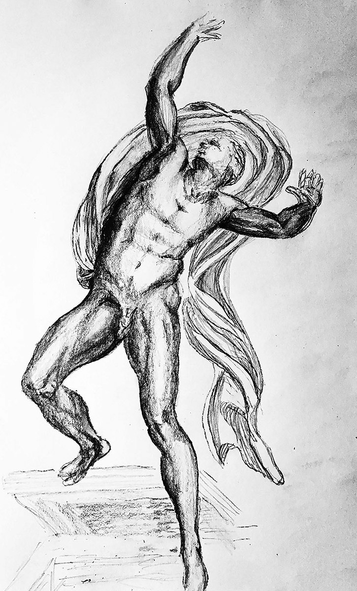
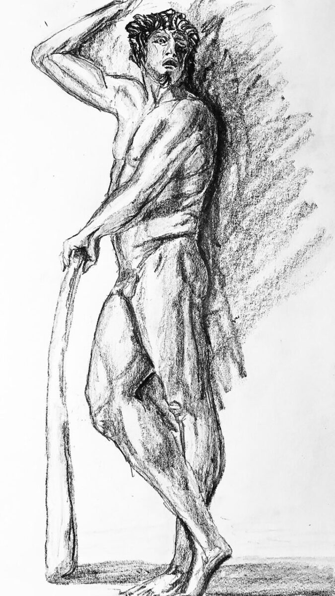
Now lets get back to Tiepolo, who is considered the greatest Italian Rococo painter. Unfortunately he passed away on March 27, 1770. So I was never able to meet him. If I was alive back then, I would have asked him… well I can’t think of a good question. I’ll have to get back to you.