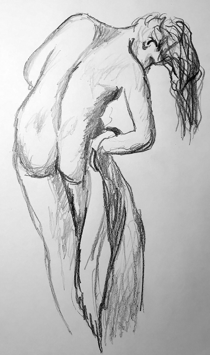
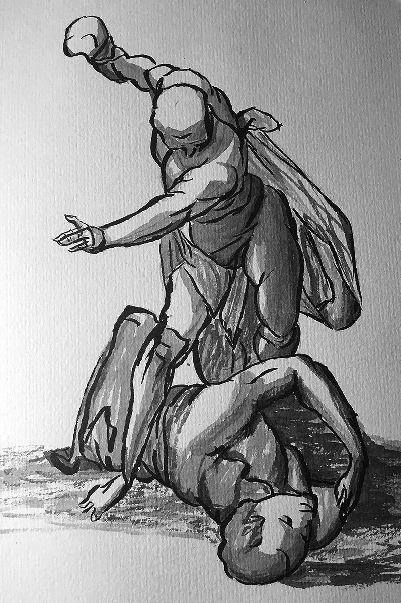
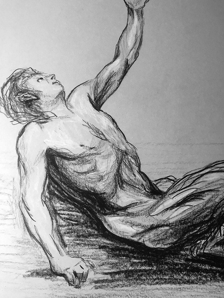
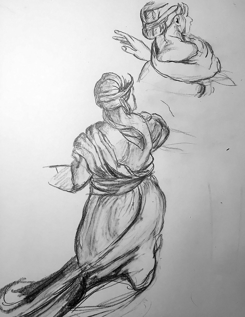
Posted on

Graphite Drawing After Jean-Baptiste Greuze

Drawing in pencil copied from a work by Jean-Baptiste Greuze

The next drawing is a copy done in graphite pencil of a work by the French artist Jean-Baptiste Greuze. His original drawing was done with red chalk on heavy cream paper. Yes, that is right. The type of paper is described as “heavy cream”. The original work by Greuze is entitled “A Seated Nude” and is in the Paul J. Sachs Collection in the Museum of Art at Harvard University in Cambridge. Now, let’s learn about Jean-Baptiste Greuze.

ChatGPT: Jean-Baptiste Greuze (1725-1805) was a French painter and draftsman known for his sentimental and moralizing genre paintings. He was born in Tournus, Burgundy, France, and displayed artistic talent from an early age. Greuze studied under the painter Charles Grandon in Lyon before moving to Paris in 1750 to continue his artistic training.

Greuze achieved recognition for his skillful depiction of domestic scenes and moral narratives that appealed to the taste of the time. His works often showed righteous characters in moving or moralistic situations, seeking to evoke empathy and stir the viewer’s conscience. Greuze’s paintings were closely aligned with the philosophical ideas of the Enlightenment period, emphasizing virtue, sincerity, and moral rectitude.

One of Greuze’s most famous works is “The Milkmaid’s Family” (1755), which portrays a young woman nursing her child while her husband looks on with tenderness. The painting exemplifies Greuze’s ability to capture intimate family moments and his focus on portraying simple, virtuous lives.

Greuze’s style is distinguished by its precise and careful approach, highlighting the careful rendering of textures, fabrics, and expressions. His works often feature soft lighting and a subdued color palette, contributing to their intimate and emotionally charged atmosphere.Despite his initial success and popularity, Greuze faced criticism later in his career for what some considered an overly sentimental and moralistic approach to art. His subject matter fell out of favor with the rise of Neoclassicism and the French Revolution, which sought to depict more heroic and politically charged scenes. Greuze’s reputation declined, and he struggled financially in his later years.

Nevertheless, Greuze’s influence on French painting should not be forgotten. His emphasis on moral themes and the emotional power of narrative would have a lasting impact on subsequent generations of artists. His works can be found in major museums around the world.

Jean-Baptiste Greuze’s contributions to art history lie in his ability to capture private moments and his commitment to moral storytelling. His paintings continue to be appreciated for their technical skill, emotional resonance, and their representation of French society during the 18th century.

Posted on

Graphite Drawing After Jacopo Pontormo

Graphite copy of a drawing by Jacopo Pontormo of a Young Man Holding a Small Child

The image accompanying this post is a copy in graphite pencil of a drawing by Jacopo Pontormo. The original drawing is described as “A Young Man Holding a Small Child”. On the other side of the paper, there is another drawing of “A Young Man Holding a Small Child”. The sheet of paper that has those two drawings is in the Scottish National Gallery of Art. Pontormo was an Italian artist that worked in the Mannerist style which strayed from the realism Renaissance art. He elongated his figures to create more expressive compositions.

According to Giorgio Vasari’s Life of the Artists, Pontormo was a very withdrawn and neurotic individual. This idea of Pontormo has managed to exaggerate the popular conception of the artist, as seen in the film, Pontormo, a Heretical Love by Giovanni Fago. It is Fago’s portrayal of Pontormo that he is engrossed in a lonely, paranoid, and often protected process of his final Last Judgment project. When Vasari was writing his Lives of the Artists, he was in intense competition with the Pontormo/Bronzino workshop, according to art historian Elizabeth Pilliod. The professional feud between the two studio owners might have provided Vasari with enough motive to run down his opponent’s artistic lineage in his quest for patronage by the Medici family.

Except for Bronzino, few were able or willing to emulate Pontormo’s artistic peculiarities. In some of Bronzino’s early paintings, the authorship is still debated whether it belongs to him or to his instructor. In some ways, Pontormo shares the Mannerism of Rosso Fiorentino and Parmigianino. It could be said that he anticipated the Baroque as well as the style of El Greco. It was also a result of his idiosyncrasies that he had an original and cohesive sense of composition. Unfortunately, Pontormo’s work was quite out of fashion for several centuries. The fact that so much of his work has been lost or harshly damaged is a testament to this neglect. Fortunately, he has received renewed attention from contemporary art historians.

Posted on

Prismacolor® Pencil Drawing After Giovanni Battista Piazzetta

Copy of a Male Nude by Giovanni Battista Piazzetta in black and white Prismacolor Pencils

This post contains a drawing in Prismacolor® pencils that was copied from a work in chalk by the Italian artist Giovanni Battista Piazzetta. That is some name, isn’t it? I counted twelve syllables. There seem to be a lot of Italian names that are of similar complexity. I feel bad for all the Italian school teachers that had to do a roll call every day. I hope they got paid overtime. I just realized how corny my sense of humor is. I have been in denial for so long. Anyway, I know a lot of you are not familiar with the name Giovanni Battista Piazzetta. I am not either but I will do some research on behalf of both of us.

I have been in denial for so long.

The following information has been taken from the Virtual Uffizi website which refers to itself as the unofficial website of the Uffizi museum in Florence, Italy. Giovanni Battista Piazzetta’s drawings and paintings were noted for their Rocco style, with subtle coloring and rounded forms of religious and genre subjects. His father was a sculptor, and Piazzetta studied woodcarving with him before studying painting with the Venetian Baroque painter, Antonio Molinari. Molinari along with the Bolognese painter, Giuseppe Crespi, and the Emilian artist, Guercino all had a big impact on Piazzetta’s work. Even though Piazzetta did not receive many commissions throughout his career, he also illustrated books with drawings to pay the bills. His illustrated work is reminiscent of Rembrandt’s paintings. In all his works, Piazzetta created complex scenes where the subject was never obvious, and his characters were immersed in more than it seemed. The subjects he created would take on several different meanings. Piazzetta also added melodramatic features and had a reputation for being a darker artist than his Venetian contemporaries. Much of his later years were spent teaching, and although not wealthy, Giovanni Battista Piazzetta was a well-respected artist.

If you would like to see a facsimile of the original which is housed in the National Gallery of Canada, Ottawa then by all means click here.

Posted on

India Ink Drawing After Luca Cambiaso

India Ink Drawing of Cain and Abel Copied from Luca Cambiaso

Next up we have a copy of a drawing of Cain and Abel by Luca Cambiaso. The original was done in pen and wash. I made my copy with India Ink on watercolor paper. Right now you are probably wondering just who is this Luca Cambiaso person. Let us consult the Italian Art Society which sounds like an organization that should know what they are talking about.

Luca Cambiaso was born in Genoa, Italy on November 18, 1527. He was a top artist in Genoa during the middle and late 16th century and ran a big and productive workshop. In his childhood, he learned to paint with his father, Giovanni Cambiaso. Luca created his first works when he was only fifteen years old. At the age of seventeen, he began working with his father on the Palazzo Doria’s decoration. Additionally, Luca assisted Il Bergamasco with decorations for the church of San Matteo. Luca partnered with Giovanni Battista Castello on several projects in the 1550s. During 1560, Cambiaso completed frescoes for the Palazzo Imperiale in Campetto, Genoa, which brought him notoriety and additional commissions. FYI: Palazzo Imperiale means Imperial Palazzo in Italian. Cambiaso was asked to work for Philip II of Spain in 1583 and you don’t say no to Philip II. San Lorenzo’s church at the Hieronymite monastery of the Escorial was his first commission.

You don’t say no to Philip II

He studied Raphael and Michelangelo’s methods, and he was open to learning new ones. Luca was also impacted by the works of Titian and Veronese. In the mid-1560s, he developed a draughtsman style that incorporates geometric forms. By the 1570s, Luca’s works began to be more reflective, which he continued to develop during the rest of his career. He influenced a lot of painters, who analyzed his frescoes in Genoa. His followers became known as the Genoese School. Luca died in Madrid on September 8, 1585.

Here is a link to see a bunch of drawings by Luca Cambiaso.

Posted on

Prismacolor® Pencil Drawing After Jean-Baptiste Deshays

Colored Pencil Drawing of a Seated Satyr Leaning Backwards

The drawing above was done with black and white Prismacolor® pencils on gray-toned paper. The subject is a Satyr, which is a Greek mythological demigod that is half man and half goat. It was copied from a drawing by Jean-Baptiste Deshays. That work was originally attributed to the more famous French artist, François Boucher. I will write about Boucher later in another blog post unless I find out that the other drawings supposedly done by him were in fact drawn by other artists. Now let’s talk about Jean-Baptiste Deshays or if you want to be even more formal, Jean-Baptiste-Henri Deshays. There is not a whole lot written about Deshays. Even the people that write for Wikipedia did not have much to say about Deshay and they seem incredibly interested in everything. The information they had was taken from the Fine Arts Museums of San Francisco. They also had one external link to the Web Gallery of Art. But unfortunately, that link went to the biography of François-Guillaume Menageot. So let us learn what we can about this talented and relatively unknown French painter.

They seem incredibly interested in everything.

Born on November 27, 1729 in Colleville, France, Jean-Baptiste Deshays first learned how to paint from his father. At the age of 20, he moved into the studio of Jean Restout II, who, like Collin de Vermont, was a student of Jean Jouvenet and followed in the grand tradition of French history painting. During his studies with Restout, Deshays learned the importance of dramatic compositions and intense colors in big religious paintings. While he was in Restout’s studio, Deshays entered the prestigious Prix de Rome competition, winning second prize in 1750 and then the first prize in 1751. Deshays was required to spend three years at the Ecole des Eleves Protégés before proceeding to Rome. The school director, Carle Van Loo helped him develop a more stylish, looser style and tone down the intense training he received from Jouvenet. During this time, he painted a number of religious paintings, which are now lost, including two large canvases, an Annunciation and a Visitation, for the Rouen monastery of the Visitation. In Rome, under the supervision of Charles-Joseph Natoire, he spent four years completing his artistic instruction. Raphael, Domenichino, Guercino, and Carracci were among the Italian masters he copied during this period. His return to Paris in 1758 was followed by his marriage to François Boucher’s eldest daughter and his membership into the Royal Academy of Painting and Sculpture. Despite only exhibiting at four official Salons, the artist was highly praised for his work.

Here is a link to Jean-Baptiste Deshays’ “Seated Satyr Leaning Backward” 1758/1765.

Posted on

Drawing in India Ink After Jacopo Tintoretto

India Ink drawing of Atlas

The above is another copy of a Tintoretto drawing located in the Museum of Budapest and is titled “Two Studies after the so-called “Atlas” Statuette.” In the description section under the drawing, it states “This record is subject to revision due to ongoing research.” So what does that mean? As I’ve mentioned in a couple of other blog posts, sometimes a work of art is found to be by another lesser-known artist. It can create quite a brouhaha. So the original drawing might have been done by one of Tintoretto’s students or assistants. Or perhaps a follower of Tintoretto or maybe even ‘gasp’ a forger with a desceptive motive. Wow, things are really heating up, aren’t they? Who knows maybe by the time you read this we might find out what the museum staff discovered. Until then we will talk about the subject of the drawing.

The following information about the myth of Atlas was borrowed or taken from classicalwisdom.com

The story of Atlas may have been founded on a Pelasgian myth, a tale associated with the original residents of Greece. Atlas was extremely powerful and had a brother named Prometheus. I wrote about Prometheus in a previous post, I hope you were paying attention. Atlas was one of Zeus’ greatest rivals and Zeus was kind of a big deal. Zeus along with the rest of the Olympians greatly feared Titan and his fellow Titans. In the end, the Olympians prevailed and conquered the Titans. The other Titans were incarcerated by Zeus in Tartarus, which is the name for hell. Since the Olympians feared and hated Atlas, they devised a special punishment for him. Atlas was sentenced to stand at the western end of the earth. He was then forced to carry the sky on his shoulders forever. According to my research, forever is a very long time. Atlas suffered a great deal because he had to bear such a hefty load. Over the centuries, a misconception emerged that he was destined to hold up the entire world. This is probably a result of artworks created during the Renaissance that misinterpreted the original myths. The Greeks believed Atlas held up the sky over what is now the country of Morocco.

Posted on

Prismacolor® Pencil Drawing After Jacopo Tintoretto

Pencil Drawing of a Young Man After Tintoretto

Here we have a Prismacolor® pencil drawing of a young man copied from a drawing of a young man drawn by Jacopo Tintoretto. Prismacolor® makes 150 different colors. I used only black and white. Why am I mentioning this? I really thought if I started writing I would be able to come up with something funny to say. As you can see, that did not happen. I realize the style of the drawing makes the young man look like a bag of walnuts but if you see the original, it kind of looks like that. It is in the collection of the governing body of Christ Church in Oxford, United Kingdom. I could not find an image of the drawing on their site. Since I am not part of the governing body, there isn’t a whole lot I can do. Here is a link to another Tintoretto drawing so you can see his style. I thought I would consult the World History Encyclopedia to find out about this exceptional artist.

These models were then placed inside a box.

The following information on Tintoretto was taken, borrowed, and perhaps stolen from the World History Encyclopedia. Tintoretto’s real name was Jacopo Robusti, and he was born in Venice in 1518. He began his career as an artist creating unassuming works such as decorated furniture and frescoes on exterior walls. It was, however, his large paintings that would make him famous. It has been said that his work combines the drawing style of Michelangelo along with Titian’s use of color. In his drawings and paintings, Tintoretto created muscular figures posed in unusual positions. Mannerism would be the name given to this technique. In the 17th century, the Mannerist style would become a major influence on artists. Tintoretto’s artistic style is also defined by his light source. He would create areas of shadow and color that are distinctive and dramatic. As part of the process of creating his work, the artist would first construct small wax models of human figures. These models were then placed inside a box. It was then possible to organize the models and use an artificial light source to illuminate them. As a result, different and unique effects of light and shadow would be created. Although today Tintoretto is considered a great Italian Master, throughout his career, he was criticized for his rapid pace and lack of finish in his art.

Posted on

India Ink Drawing After Aert de Gelder (formerly attributed to Rembrandt)

India Ink Drawing of a Nude Woman with Her Arm Raised

As I have mentioned earlier posts, I have been in the process of copying old master drawings from a book entitled “Anatomy Lessons by the Great Masters” by Robert Beverly Hale. The India ink drawing above is a copy of a work done in pen and wash by Rembrandt van Rijn. When I went to find information on the original drawing, I discovered that Rembrandt did not draw it. It had been reattributed to another Dutch painter named Aert de Gelder. You are probably asking yourself, who is this person named Rembrandt? Believe it or not, there is a lot of information on him everywhere in the form of articles, books, movies, etc. A much better question would be: who is this guy named Aert de Gelder? Let’s find out together. The following information is taken from the Thyssen-Bornemisza National Museum in Madrid, Spain. On their website it states that it is in fact ‘Everyone’s Museum’. So, in the interest of inclusivity we will rely on their information.

There isn’t a lot written about Aert de Gelder.

He began his training as an artist in his hometown of Dordrecht, Holland. In 1661, he moved to Amsterdam to complete his training in Rembrandt’s studio. Aert de Gelder was considered Rembrandt’s best and closest follower. De Gelder uses broad brushstrokes that are heavily pigmented, and he often applies the pigment with a spatula or his fingers. By using the other end of the brush, the artist could also create effects by scratching into the wet paint. The most distinctive aspect of De Gelder’s style was his use of color, especially from the start of the 18th century onwards, when he began to add whites, yellows, blues, greens, violets, and oranges. Like the color orange, not the actual fruit. Although maybe he did attach fruit to his paintings. There isn’t a lot written about Aert de Gelder.

Click here if you would like to see a digital copy of a drawing of a woman with her arm raised by Aert de Gelder.

If you would like to purchase the book: Anatomy Lessons of The Great Masters by Robert Hale click here.

Posted on

Graphite Drawing After Andrea del Sarto

Pencil Drawing of St. John the Baptist

Here is yet another graphite pencil drawing copied from the work by an old master of the Italian Renaissance. I am well aware that the drawing looks like an old hippy with a frisbee but it is actually a drawing of St. John the Baptist holding a frisbee after the artist Andrea del Sarto. To learn more about our featured artist, I typed the name Sarto into a Google search. But unfortunately, I got images of shoes by Franco Sarto. Lots and lots of shoes. So I then typed the name Andrea del Sarto into the search bar and found some information that might be useful. The following particulars come from the fine person(s) at Wikipedia.

Andrea del Sarto, originally named Agnolo di Francesco di Luca, was an Italian painter from Florence who prospered during the High Renaissance and early Mannerism periods. Due to the fact that his father, Agnolo, was a tailor, which means Sarto in Italian, he became known as “del Sarto.” (meaning “tailor’s son”). Pretty clever, eh? Born in 1486, Andrea del Sarto was first apprenticed to a goldsmith in 1494, and later to a woodcarver and painter named Gian Barile. Then he apprenticed to Piero di Cosimo and Raffaellino del Garbo. If you’re like me you have no idea who all of these people are. In addition to his talents as a painter, he was also a sculptor, a draftsman, a fresco decorator, and a colorist. Del Sarto was highly regarded during his lifetime. Unfortunately, after his death, his legacy was overshadowed by the likes of Leonardo da Vinci, Raphael, and Michelangelo.

“On the bright side…”

On the bright side, Andrea del Sarto inspired a play that was written by Alfred de Musset in 1848 aptly titled “Andre del Sarto”. But wait there’s more. Based on Alfred de Musset’s 1848 play, Jean-Yves Daniel-Lesur composed, once again aptly titled, “Andrea del Sarto” in 1968.

If you want to see the original drawing in person you will have to visit the National Gallery of Victoria located in Southbank, Melbourne, Australia. Here are the coordinates: 37.822595°S 144.968634°E.

Click on the link, if you would like to see a facsimile of the original drawing by Andrea del Sarto of St. John the Baptist.