Posted on

Copy of Titian’s “Study for St. Sebastian”

"Study for St. Sebastian" after Titian

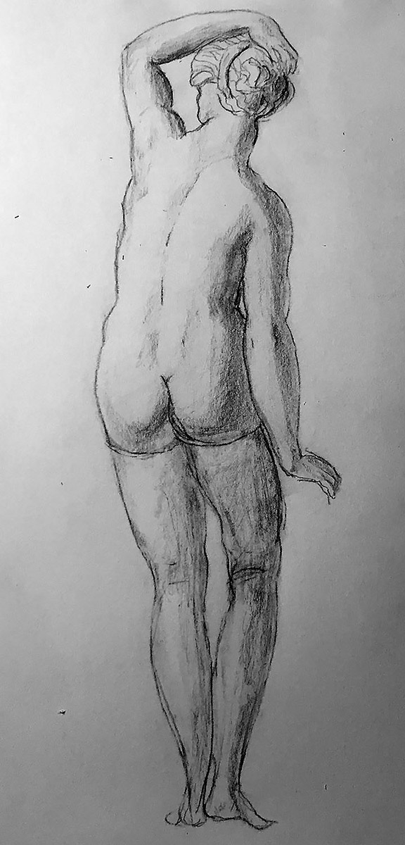
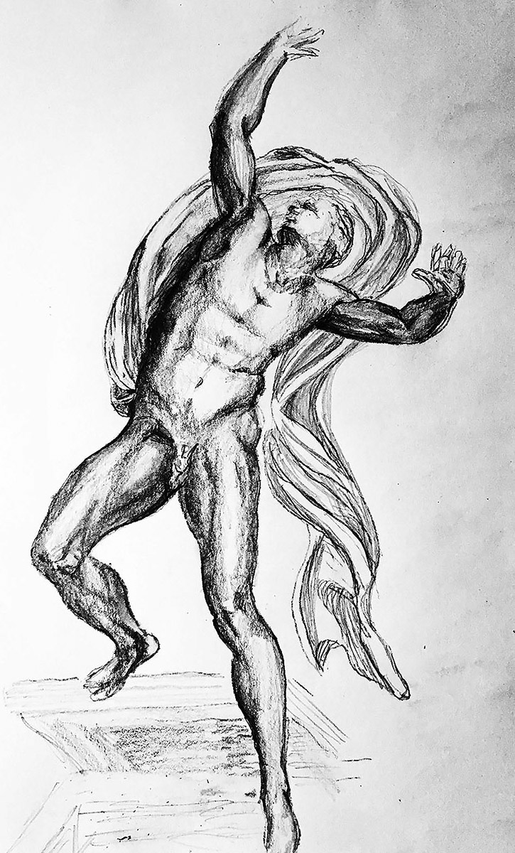
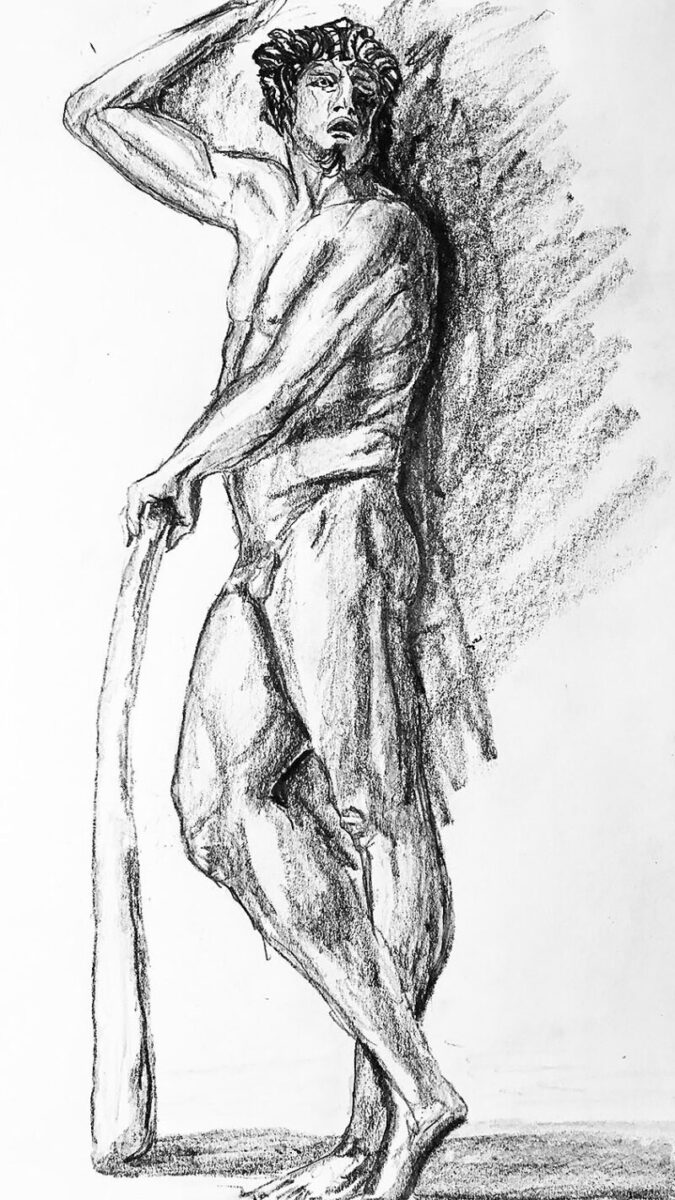
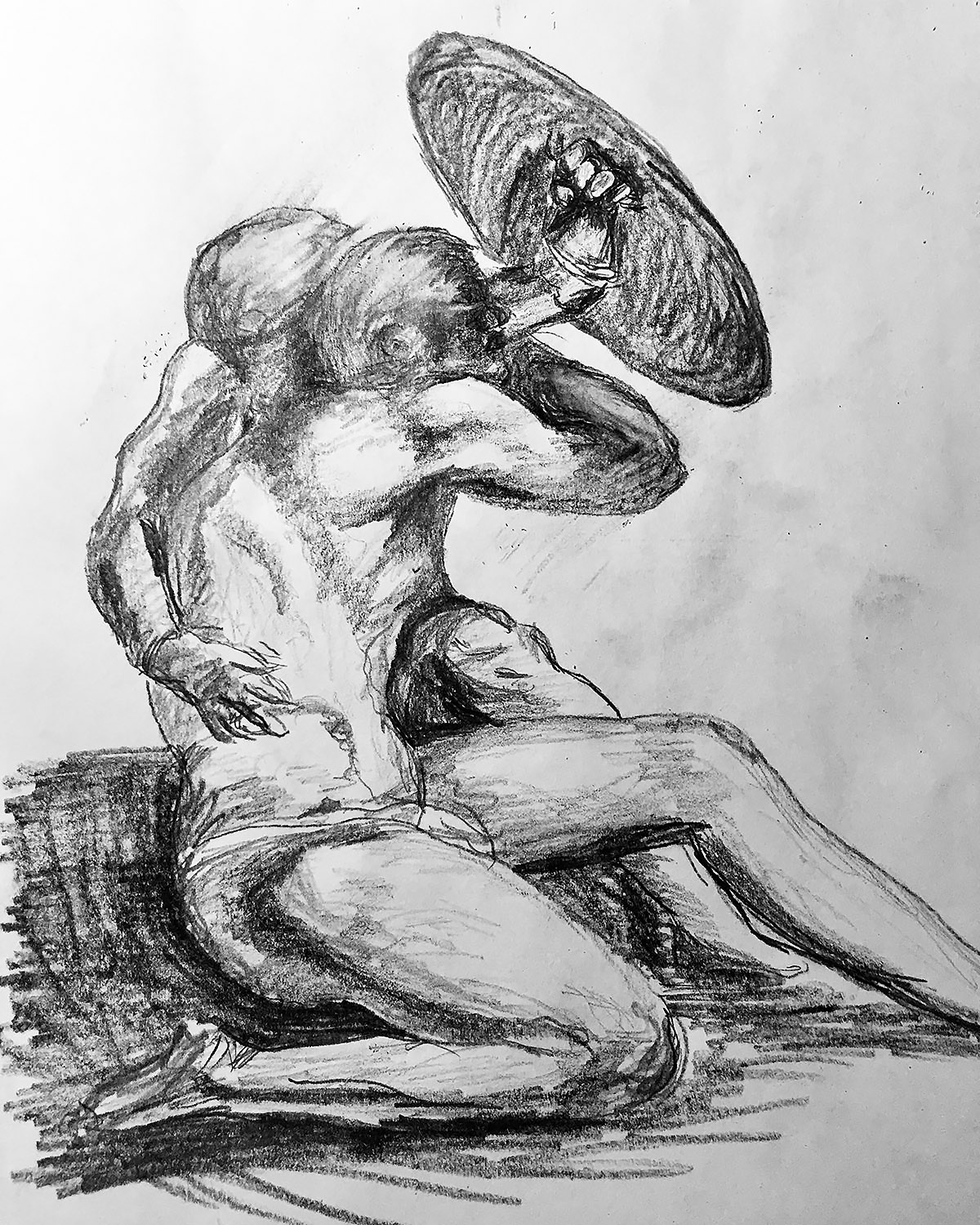
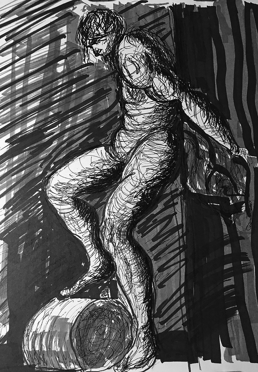
Above is a copy of a drawing by Titian titled “Study for St. Sebastian in the high altar of SS. Nazarro e Celso, Brescia”, created around 1519 to 1520, and drawn with brown ink, brown washes, heightened with white on grey-blue laid paper. Titian’s work was done with thick ink lines so I substituted my usual pencils with a gel ink pen along with an of assortment black and gray markers.

Tiziano Vecellio, simply known as Titian, was considered by many to be the greatest painter in Venice, Italy during the 1500s. He was born in Pieve di Cadore, a small town near the Alps, and then moved to Venice at the age of 10. He started his artistic training at the Sebastiano Zuccato workshop. Then went to work with Giovanni Bellini, who at the time was already a well known artist. Titian also worked alongside with Giorgione, who would greatly influence his style. Around 1511, Titian began an independent career in Venice. He went on to create the frescoes in the Scuola del Santo in Padua in what is known as his mature style. He became famous for his religious works as well as his portrait paintings. Titian continued to paint and his work was in high demand all across Europe. Around 1545, Titian traveled to Rome and met Michelangelo who greatly influenced his work. Throughout the rest of Titian’s life, his brushwork became looser and more expressive. Artists ranging from Sir Joshua Reynolds to Jean Auguste Dominique Ingres as well as the French Impressionists were all influenced by the work of Titian.

My former painting instructor, Bob Gross, also an excellent artist, was a big fan of Titian. Bob taught the painting techniques used by Titian and the other old masters. He would often talk about the glazes or thin layers of color that Titian layered on top of each other to create unique color combinations. Bob was an amazing teacher. Unfortunately he passed away earlier this year. Myself along with his other students will always remember his teachings and of course his fondness for Titian.

Posted on

Drawing Copied from Bronzino, Who Copied it from Bandinelli

Female Nude Pencil Drawing

The above drawing is a copy of a work by the Italian artist Agnolo Bronzino. He is usually known by just Bronzino. Because, how many well known artists have the last name of Bronzino? Maybe 12 or 20. So it is not too confusing just to call him Bronzino. According to my research, the original was done in the 16th century. Which is seems rather vague. Bronzino lived between 1503 – 1572 so saying the drawing was done in the 16th century is a safe bet. Like many Italian Renaissance works, it was done in black chalk. I do not care for the scratchy-ness of chalk, so I did mine in pencil. A regular number 2 pencil and a darker one. Maybe a 4B or 6B. The number is for the darkness of the graphite and the letter “B” means soft. An “H” would signify a hard graphite. So to help you remember: H for Hard and B for… never mind. Bronzino’s drawing is actually a copy of a sculpture done by another 16th century Renaissance artist, Bartolommeo Bandinelli. The sculpture is of Cleopatra.

“I do not care for the scratchy-ness of chalk.”

So let’s sum up what we have covered so far. I copied a Bronzino drawing that was copied from a Bandinelli sculpture. Bartolommeo Bandinelli was a “Florentine Mannerist” and was greatly influenced by Donatello. Bandelli became a much celebrated sculptor until he was overshadowed by Michelangelo. Agnolo Bronzino was influenced by Jacopo da Pontormo, whom I talked about in previous posts. Bronzino and Pontormo also worked together on the decorations for two churches in Florence, Italy. As opposed to the city Florence in Kentucky or the ten other cities in America named Florence. Bronzino borrowed Pontormo’s expressive mannerist style and then created a his own clean linear style. His art was also influenced somewhat by Michelangelo as well as the later works of Raphael.

The drawing I copied of Cleopatra from Bronzino can be found in the Fogg Museum at Harvard University in Cambridge, Massachusetts.

Posted on

Graphite Drawing of Risen Christ After Michelangelo

Copy of Michelangelo Drawing

Here is a graphite pencil drawing after Michelangelo titled “The Risen Christ”. The original was drawn in black chalk around 1532. It is part of the Royal Collection Trust in the United Kingdom. There are over one million articles in the collection which includes 150,000 works on paper. Apparently, it is all owned by Queen Elizabeth II. Most of the old master drawings where acquired by King George III. The original drawing might have been done as a finished work of art rather than a preparatory sketch. I would assume it is not to hard to find this drawing by Michelangelo in the Royal Collection. Because of it’s importance it must be on display in a conspicuous place. I would hate to think that is hidden in a large pile of 150,000 pieces of paper. But then again if the Queen owns so many items then she just might be a hoarder. In that case there might be several large cardboard boxes of drawings jammed into the Royal garage or perhaps stored up in the Buckingham Palace attic.

“I would hate to think that is hidden in a large pile of 150,000 pieces of paper.”

Moving on, I came across an interesting quote by Michelangelo regarding drawing. “The science of design, or of line-drawing, is the source and very essence of painting, sculpture, architecture. Sometimes it seems that all the works of the human brain and hand are either design itself or a branch of that art.” He also said “Draw, Antonio; draw, Antonio; draw and don’t waste time.” So as you can see, drawing is very important. I would assume that it is important for many people and not just Antonio. But the fact that he singled out Antonio means that drawing is even more important for Antonio. Unfortunately Michelangelo destroyed a lot of his drawings so others wouldn’t see how he developed his work. Here are a couple of more quotes to ponder “If you knew how much work went into it, you wouldn’t call it genius.” And “If people knew how hard I worked to get my mastery, it wouldn’t seem so wonderful at all.”

Posted on

Graphite Drawing After Benvenuto Cellini

Benvenuto Cellini Copy

Here we go again with another copy of another Italian Renaissance master. This time it is Benvenuto Cellini. The drawing I copied is in the National Gallery of Art in Washington DC. The good news is that it free to visit. The bad news is that this particular drawing is not on view. It was made black chalk with brown ink and wash on laid paper. I drew mine with graphite pencils on Strathmore paper. It is titled “A Satyr”. In the book I’m copying it from, it is titled “Drawing of a Satyr for the Portal of Fontainebleau.” I searched for the “Portal of Fontainebleau” and I got very lost. I was hoping to find something I could write about.

I shall write about Benvenuto Cellini. Mr. Cellini was born on November 3, 1500 and died on February 13, 1571. Besides writing his famous autobiography, he was also a goldsmith, draftsman, sculptor and painter. Cellini was an important artist in the style of Mannerism. This style of art separated itself from the calm and orderly art of the High Renaissance by distorting its subjects to add tension and drama. He also wrote poetry, as well as treatises on goldsmithing and casting in bronze. It would be great if he wrote about drawing then I could just copy and paste it into this blog.

“I was hoping to find something I could write about.”

Anyway, reading Cellini’s autobiography is a good way to learn about him. I listened to it on audiobook a long time ago so I don’t really remember it, which is unfortunate because then I could write about that. I think I’ll write about some of the reviews for his autobiography I found on Amazon. “An intriguing look into an artist’s life in Renaissance Italy” said Jack. David says he read this book over 50 years ago in college. I like that review because it makes me feel young. Reviewer MickJazz says the book was recommended to him by a designer from Ohio. I listened to it on audiobook. I can’t remember if someone recommended it or not.

Here is a garden variety link to see Benvenuto Cellini’s Drawing of a Satyr for the Portal of Fontainebleau.

Posted on

Graphite Drawing After Piombo

Copy of a Piombo Drawing

The next study is of a female nude by Sebastiano Piombo. The copy you see was done in graphite pencil. The original was done in chalk. I could have used chalk but it can be messy. Someone once told be that I am “afraid to get my hands dirty”. I would have liked to disagree but there is a lot of truth to it. I am not excited by the idea of soiling my precious hands. That reminds be that I should probably disinfect my keyboard. At this point you are wondering if I am telling the truth or kidding. It all depends. If I say something that diminishes your opinion of me then I am definitely joking. Or if you are offended by something I write, then I am without a doubt pulling your leg.

“He was also a student and/or friend of Michelangelo.”

Sebastiano Piombo was primarily a painter who was born in Venice sometime between 1511 and 1527. He died in Rome anywhere from 1531 to 1547. I’m never sure how hard art historians searched to find the exact dates of when Piombo was born and died. I do have a theory. According to the Louvre website, where the original drawing is, Piombo went by several names. Some of the various names were Sebastiano del Piombo, Fra Sebastiano del Piombo, De Lucianis Sebastiano, Del Piombo Sebastiano and Lucianis Sebastiano de. So having to research all those different names would be quite exhausting. This might be it why there isn’t much information on the internet about you know who. It is believed that Piombo was a student of both Bellini and Giorgione. He was also a student and/or friend of Michelangelo. That part of his life would be extremely important to research. Maybe someone could do that. If you find anything interesting about Piombo’s life please let me know. It is getting hard to write about him.

Posted on

Prismacolor® Pencil Drawing After Durer

Copy of an Albrecht Dürer Drawing

Alright so this drawing is copied from a work by the German artist Albrecht Dürer. I’m glad I was able to type the umlaut (those two little dots) over the letter ‘u’. The original drawing is titled Lucretia. He also made a painting of Lucretia as well. The story of Lucretia is very depressing and makes men look really bad so I’m going to skip it. The drawing is in the Albertina Museum in Austria. It is a preliminary study for the painting “Suicide of Lucretia” that is in the Alte Pinakothek, Munich. I like to list the locations of the artwork just in case you want to partake in a art history wild goose chase. But I digress, the original drawing, according to the book I’m drawing from, was done in black ink. The Albertina website says it was done in “Pinsel in Schwarz und Grau, grau laviert, mit Deckweiß gehöht, auf grün grundiertem Papier, partiell vorgeritzt oder mit spitzem Werkzeug übertragen (?)” which translated into “Brush in black and gray, washed with gray, heightened with opaque white, on green primed paper, partially pre-scored or transferred with a sharp tool (?)”. The question mark in parenthesis leads me to believe that they might be just as confused as I am. I created my drawing in black and white prismacolor pencils on gray cardstock. Prismacolor makes 150 different colors of pencils. I just used black and white in my drawing. Mainly because the original is in black and white.

“Writing for an algorithm is probably the most uninspiring thing you can do.”

This might be the most boring blog post ever. I read that blog posts should be at least 300 words long for the google search engine algorithm to recognize my website. Writing to a algorithm is probably the most uninspiring thing you can do. I mean I should imagine that I’m actually connecting with a person on some level. Instead I’m trying to convince software programs that I’m important. Yes that’s right I am trying to connect with a machine so that someday I might connect with other people. That thought is sad and somewhat interesting at the same time. Later.

Posted on

Graphite Drawing After Michelangelo

Michelangelo Copy

The original is titled “A male nude with proportions indicated” I however, left off the proportions, so now it is just a male nude. The drawing by Michelangelo is in the Royal Collection in merry ole’ England. The original was done in two shades of red chalk. I did mine in two shades of pencil. I guess I could use chalk but it has that ‘scratchy’ feel to it that I do not care for. Of course graphite pencil is not incredibly smooth. If you find that interesting, then I am speechless. But I need to finish this blog post so I will continue.

“What are those writing issues?”

I am writing this post in the ‘word counter.net’ online application. It gives me important information about my writing. For instance, up to this point, it should have taken you about 32 seconds to read this. If you were speaking it out loud for some strange reason, then it would have taken you about 50 seconds. Fascinating stuff indeed. It also shows that I am writing at the 7 to 8th grade level. And believe it or not it is doing this all for FREE! It keeps reminding me that I should upgrade to the application ‘Grammerly’ which checks for grammar, spelling issues and plagiarism. I can even do a brief check for free. Let’s do that now, shall we. It says I have, 2 issues of grammar, 4 spelling mistakes, 12 punctuation “errors” (which in my writing style is actually pretty darn good) and 8 additional writing issues. What are those writing issues? I would have to pay to find out. But since I’ve been humiliated already I think I will leave it there. On the plus side, they did not find any problems of plagiarism and I consider that to be a big win!

Posted on

Graphite Drawing After Michelangelo

Copy of a Michelangelo Drawing

Graphite pencil figure drawing after Michelangelo Buonaratti. The original drawing is described as “A nude young man, to front, looking to right, beckoning”. The sketch by Michelangelo can be found at The British Museum. Once again I must emphasize that it is from THE British Museum and not just any run of the mill British Museum. For example the Dog Collar Museum in North Yorkshire. You know the one in Leeds Castle. Moving on, although I drew my copy in pencil, the original was done in pen and not one but two shades of brown ink. Both shades of brown ink are known as iron gall ink. When I say ‘known’. I mean ‘known’ by people other than me. So I had to research it.

“Iron salt is salt with iron in it.”

Are you ready for some fancy book learning? Iron gall ink is made from iron salts and tannic acids. Iron salt is salt with iron in it. That should help clear things up. The tannic acid came from vegetables. Iron Gall ink was used in Europe from the 400s and is still being used today. It can be found on Amazon as well as various pen supply stores. It cannot be found at Michaels Craft Stores or Hobby Lobby “home of oily paint and signs with religious expressions”. If your the handy type, there is a recipe to make your own at instructables.com

So now I should write something about Michelangelo. From what I understand he would often destroy his drawings so people wouldn’t know how he developed his figures. According to artist and biographer, Giorgio Vasari said that Michelangelo burned his drawings “so that no one should see the labors he endured and the ways he tested his genius, and lest he should appear less than perfect.” Out of the thousands he made there are only a few hundred still with us today.

Posted on

Graphite Drawing After Raphael

Pencil drawing after Raphael

This here image is a drawing I made from a sketch by Raphael Sanzio entitled “Two Naked Figures Crouching under a Shield” which was drawn about 1512 during the Italian Renaissance. My copy was drawn during the Covid Pandemic. The original drawing is in the Royal Collection Trust in London. So if you want to see it, you have to be in the Royal Family or visit Windsor castle between 10am and 5pm (Closed Wednesdays and Thursdays). I had to visit their website to verify the hours. That just goes to show you how well researched my blog posts are. The copy I made is somewhere around here. I just have to remember where I put it. OK now I know where it is. If you want to see mine you can contact me and make an appointment. Mine is like the one by Raphael but not as important nor as finely drawn. It is newer though.

“He was known to speak with a Brooklyn accent.”

Now let’s start some fancy art history learning. Here is some interesting information I found on the internet. Raphael was the second oldest of the brothers, but was often portrayed as the eldest. Raphael is usually shown with a red mask over one eye. Raphael carried a twin sai, the points were very sharp. He used this as his main weapon. Raphael was known for being short-tempered, aggressive, sullen, and extremely rebellious. He was known to speak with a Brooklyn accent. His mask was red so it is possible that the color red represented anger. Raphael was always angry for some unknown reason. He believed he is one of a kind and therefore will always be alone. His nickname was Raph and he is one of the four main characters of the Teenage Mutant Ninja Turtles and .. oh no I searched for the wrong Raphael, I’m so very sorry.