Posted on

Prismacolor® Pencil Drawing After Durer

Copy of an Albrecht Dürer Drawing

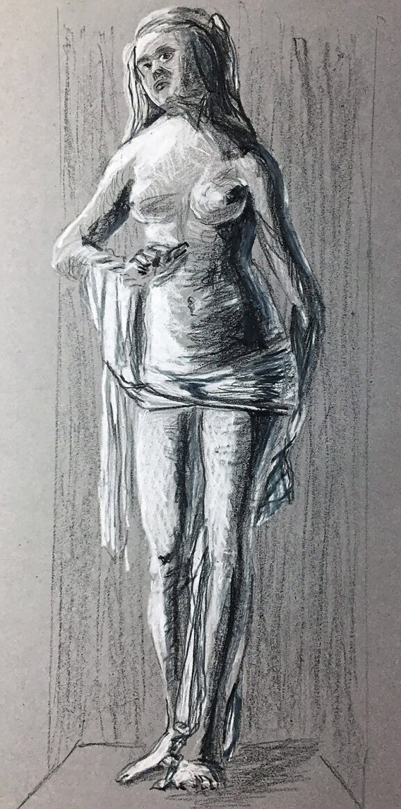
Alright so this drawing is copied from a work by the German artist Albrecht Dürer. I’m glad I was able to type the umlaut (those two little dots) over the letter ‘u’. The original drawing is titled Lucretia. He also made a painting of Lucretia as well. The story of Lucretia is very depressing and makes men look really bad so I’m going to skip it. The drawing is in the Albertina Museum in Austria. It is a preliminary study for the painting “Suicide of Lucretia” that is in the Alte Pinakothek, Munich. I like to list the locations of the artwork just in case you want to partake in a art history wild goose chase. But I digress, the original drawing, according to the book I’m drawing from, was done in black ink. The Albertina website says it was done in “Pinsel in Schwarz und Grau, grau laviert, mit Deckweiß gehöht, auf grün grundiertem Papier, partiell vorgeritzt oder mit spitzem Werkzeug übertragen (?)” which translated into “Brush in black and gray, washed with gray, heightened with opaque white, on green primed paper, partially pre-scored or transferred with a sharp tool (?)”. The question mark in parenthesis leads me to believe that they might be just as confused as I am. I created my drawing in black and white prismacolor pencils on gray cardstock. Prismacolor makes 150 different colors of pencils. I just used black and white in my drawing. Mainly because the original is in black and white.

“Writing for an algorithm is probably the most uninspiring thing you can do.”

This might be the most boring blog post ever. I read that blog posts should be at least 300 words long for the google search engine algorithm to recognize my website. Writing to a algorithm is probably the most uninspiring thing you can do. I mean I should imagine that I’m actually connecting with a person on some level. Instead I’m trying to convince software programs that I’m important. Yes that’s right I am trying to connect with a machine so that someday I might connect with other people. That thought is sad and somewhat interesting at the same time. Later.

Posted on

Graphite Drawing After Michelangelo

Michelangelo Copy

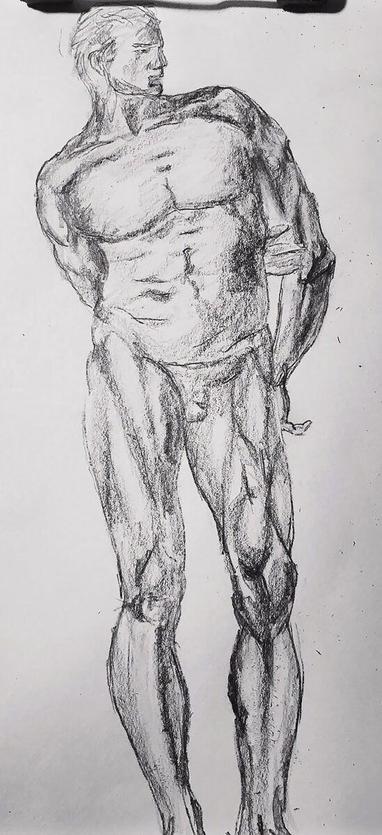
The original is titled “A male nude with proportions indicated” I however, left off the proportions, so now it is just a male nude. The drawing by Michelangelo is in the Royal Collection in merry ole’ England. The original was done in two shades of red chalk. I did mine in two shades of pencil. I guess I could use chalk but it has that ‘scratchy’ feel to it that I do not care for. Of course graphite pencil is not incredibly smooth. If you find that interesting, then I am speechless. But I need to finish this blog post so I will continue.

“What are those writing issues?”

I am writing this post in the ‘word counter.net’ online application. It gives me important information about my writing. For instance, up to this point, it should have taken you about 32 seconds to read this. If you were speaking it out loud for some strange reason, then it would have taken you about 50 seconds. Fascinating stuff indeed. It also shows that I am writing at the 7 to 8th grade level. And believe it or not it is doing this all for FREE! It keeps reminding me that I should upgrade to the application ‘Grammerly’ which checks for grammar, spelling issues and plagiarism. I can even do a brief check for free. Let’s do that now, shall we. It says I have, 2 issues of grammar, 4 spelling mistakes, 12 punctuation “errors” (which in my writing style is actually pretty darn good) and 8 additional writing issues. What are those writing issues? I would have to pay to find out. But since I’ve been humiliated already I think I will leave it there. On the plus side, they did not find any problems of plagiarism and I consider that to be a big win!

Posted on

Graphite Drawing After Michelangelo

Copy of a Michelangelo Drawing

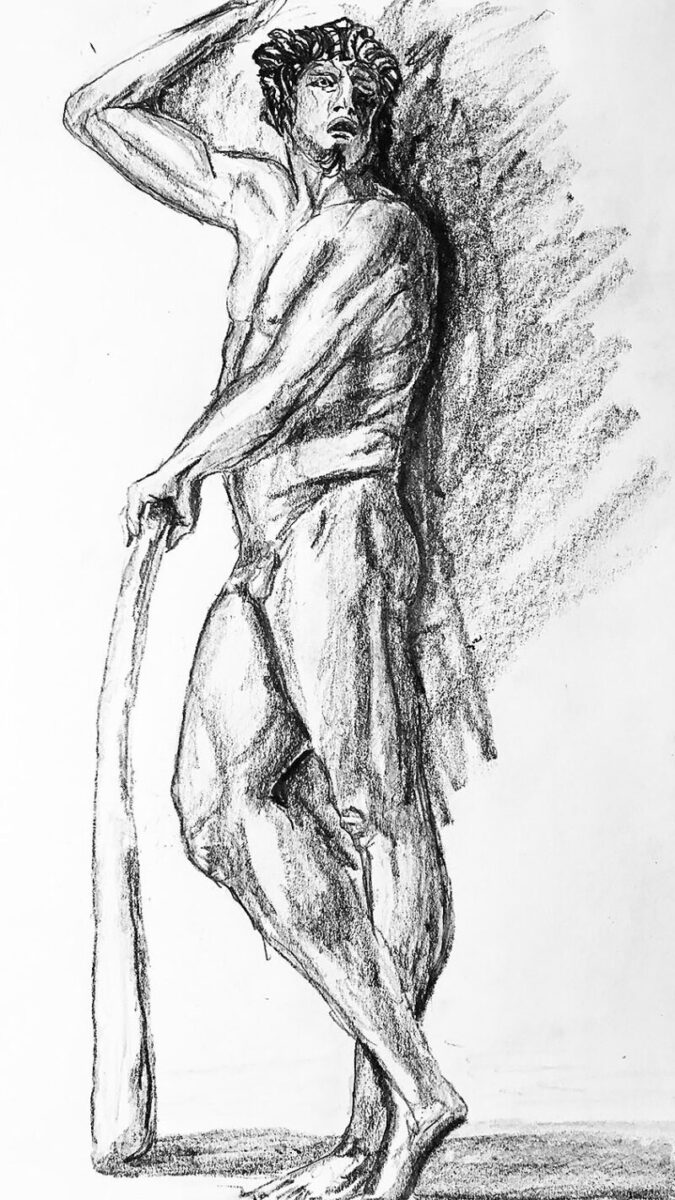
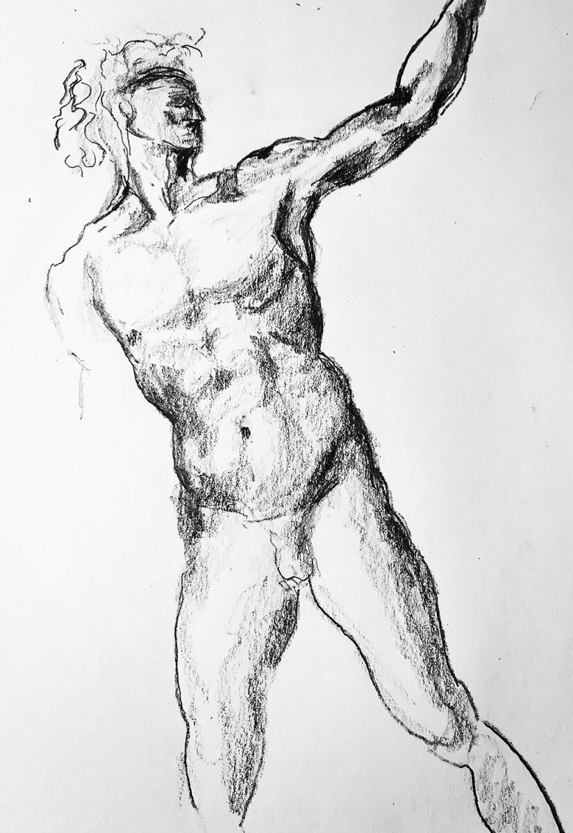
Graphite pencil figure drawing after Michelangelo Buonaratti. The original drawing is described as “A nude young man, to front, looking to right, beckoning”. The sketch by Michelangelo can be found at The British Museum. Once again I must emphasize that it is from THE British Museum and not just any run of the mill British Museum. For example the Dog Collar Museum in North Yorkshire. You know the one in Leeds Castle. Moving on, although I drew my copy in pencil, the original was done in pen and not one but two shades of brown ink. Both shades of brown ink are known as iron gall ink. When I say ‘known’. I mean ‘known’ by people other than me. So I had to research it.

“Iron salt is salt with iron in it.”

Are you ready for some fancy book learning? Iron gall ink is made from iron salts and tannic acids. Iron salt is salt with iron in it. That should help clear things up. The tannic acid came from vegetables. Iron Gall ink was used in Europe from the 400s and is still being used today. It can be found on Amazon as well as various pen supply stores. It cannot be found at Michaels Craft Stores or Hobby Lobby “home of oily paint and signs with religious expressions”. If your the handy type, there is a recipe to make your own at instructables.com

So now I should write something about Michelangelo. From what I understand he would often destroy his drawings so people wouldn’t know how he developed his figures. According to artist and biographer, Giorgio Vasari said that Michelangelo burned his drawings “so that no one should see the labors he endured and the ways he tested his genius, and lest he should appear less than perfect.” Out of the thousands he made there are only a few hundred still with us today.

Posted on

Graphite Drawing After Raphael

Pencil drawing after Raphael

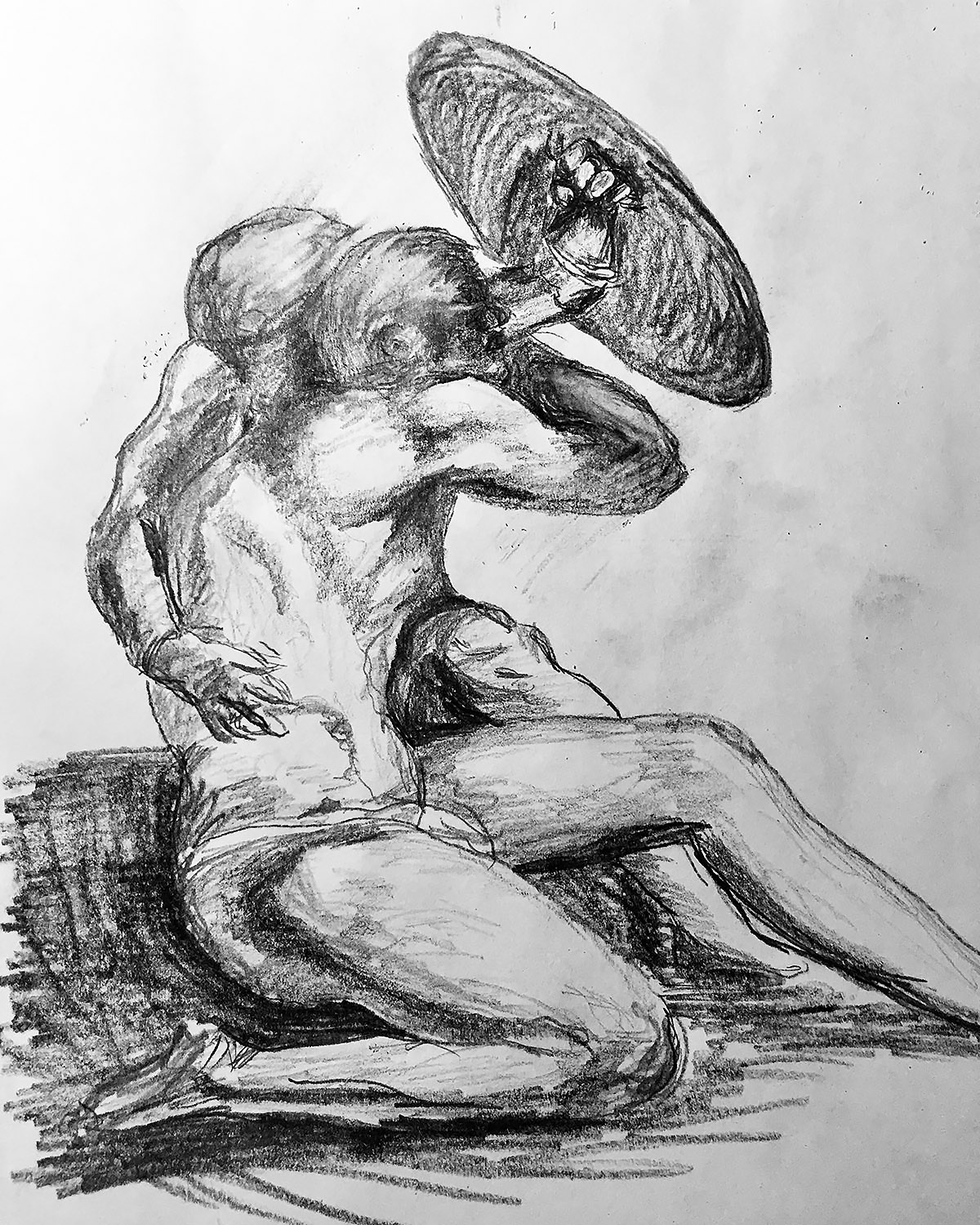
This here image is a drawing I made from a sketch by Raphael Sanzio entitled “Two Naked Figures Crouching under a Shield” which was drawn about 1512 during the Italian Renaissance. My copy was drawn during the Covid Pandemic. The original drawing is in the Royal Collection Trust in London. So if you want to see it, you have to be in the Royal Family or visit Windsor castle between 10am and 5pm (Closed Wednesdays and Thursdays). I had to visit their website to verify the hours. That just goes to show you how well researched my blog posts are. The copy I made is somewhere around here. I just have to remember where I put it. OK now I know where it is. If you want to see mine you can contact me and make an appointment. Mine is like the one by Raphael but not as important nor as finely drawn. It is newer though.

“He was known to speak with a Brooklyn accent.”

Now let’s start some fancy art history learning. Here is some interesting information I found on the internet. Raphael was the second oldest of the brothers, but was often portrayed as the eldest. Raphael is usually shown with a red mask over one eye. Raphael carried a twin sai, the points were very sharp. He used this as his main weapon. Raphael was known for being short-tempered, aggressive, sullen, and extremely rebellious. He was known to speak with a Brooklyn accent. His mask was red so it is possible that the color red represented anger. Raphael was always angry for some unknown reason. He believed he is one of a kind and therefore will always be alone. His nickname was Raph and he is one of the four main characters of the Teenage Mutant Ninja Turtles and .. oh no I searched for the wrong Raphael, I’m so very sorry.

Posted on

Graphite Drawing After Peter Paul Rubens

Jesus Christ drawing after Rubens

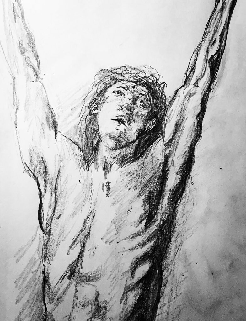
The next offering is a copy of a drawing by the Flemish master, Peter Paul Rubens. The original is in The British Museum. Not just any British Museum but THE British Museum. You know the one at the corner of Great Russell Street and Montague Place. It’s right next to the Arby’s. Rubens drew with black chalk added brown wash, and some white. It didn’t say what kind of brown wash or what kind of white. For my copy, I just used a pencil. A 6B I think. The ‘B’ means soft and the 6 is for the darkness. I’m almost positive I also used a 2H or I think 2B or may be not 2B that is the question. Moving on, the original drawing was or I should say still is, because I don’t think paper shrinks when it gets older is 527 millimeters tall and 370 millimeters wide. I drew mine on 9 inch by 12 inch paper. It would be very helpful to you the reader to stick with one unit of measurement. But then I would have to convert some of the measurements and even then you might not care anyway. So I’ll just leave it to you. I figure if you have enough free time and are so starved for entertainment that you are reading this blog then you probably might even stop and convert millimeters to inches and / or inches to millimeters. That was what would be considered a ‘run on’ sentence. It was also insulting to you the reader. I know you are an important person and your time is very valuable. You are also reading this post because you believe that I will discuss the great Flemish artist Peter Paul Rubens. Here we go.

“That was an exhausting sentence.”

Rubens was born on June 28, 1577 in Siegen, Westphalia. Where is Siegen? According to Wikipedia, Siegen is a city in Germany, in the southern part of Westphalian of the North Rhine -​ Westphalia. It is located in the district of Siegen – Wittgenstein in the Arnsberg region. That was an exhausting sentence. I think I’m going to call it a day.

Click here to see the drawing of Jesus by Peter Paul Rubens.

Posted on

Graphite Drawing After Jacopo da Pontormo

Jacopo da Pontormo copy

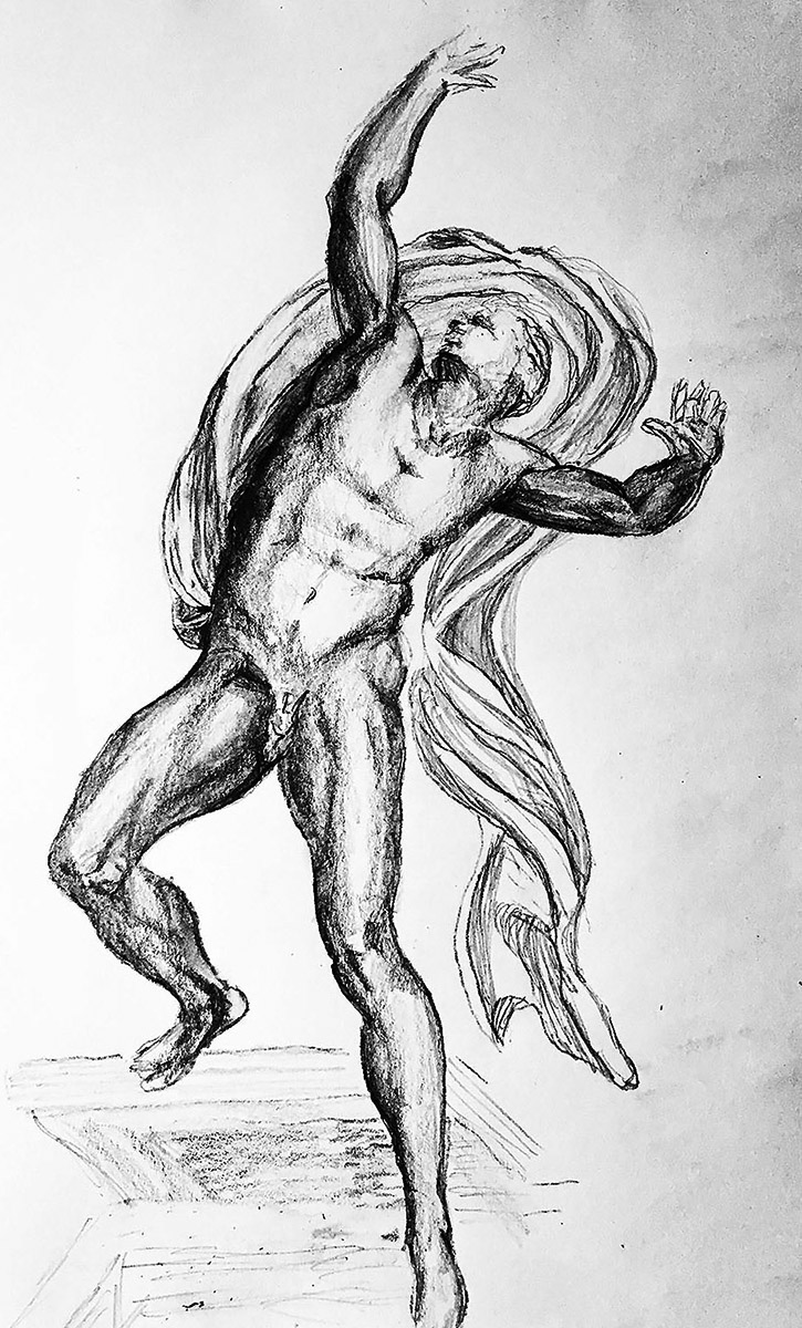
At the start of the pandemic, I was bored I mean like really bored. I had a book of 100 old master drawings. So I thought I might try to copy all of the drawings in the book. I have been posting them on my instagram and twitter accounts with brief and often inaccurate descriptions. I am now going to post them on my blog with longer, much longer and perhaps more inaccurate descriptions. Enjoy!
Please note that a few of the drawings were so bad that I couldn’t bring myself to posting them.
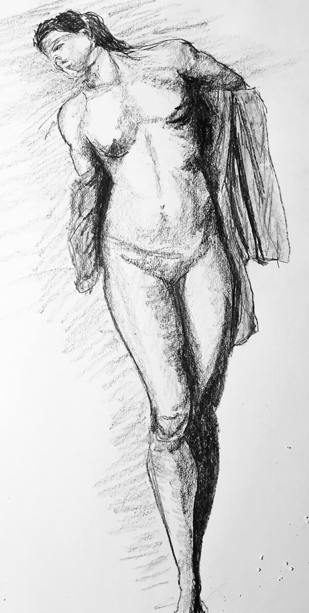
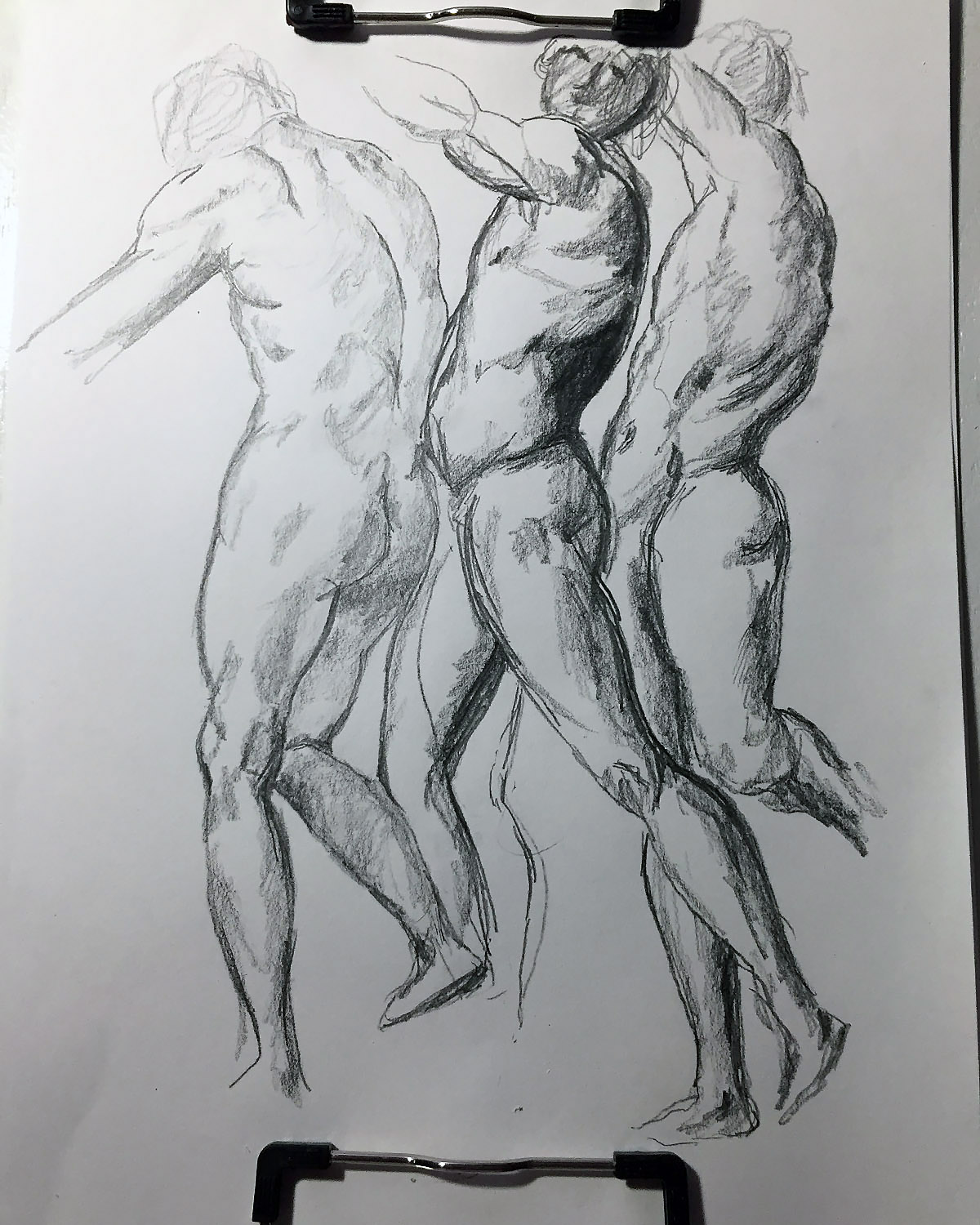
Our first offering is a copy of a drawing by Jacopo da Pontormo. His name originally was Jacopo Carrucci, (May 24, 1494 – January 2, 1557, Florence). I can only assume he changed it so he wouldn’t be associated with his dimwitted family members. We can all relate.

“…inaccurate information is preferable…”

He worked under Leonardo da Vinci and then joined Andrea del Sarto’s group of merry men. This is according to the writings of Giorgio Vasari. Most of what we know about Italian Renaissance artists, we learned from Giorgio Vasari. If Vasari was a pathological liar then the most of what we know about artists of the Italian Renaissance is totally wrong. But since inaccurate information is preferable to no information I will continue to paraphrase Vasari.
Da Pontormo painted mainly religious scenes because that were the money was. He also created work for the famous Medici family. He stole, I mean borrowed ideas from Albrecht Durer and Michelangelo. I stole, I mean copied some of Durer and Michelangelo’s work in posts to come later. Right now we are talking about Jacopo. Try to stay on topic.
The artist formerly known as Jacopo Carrucci, now Jacopo da Pontormo was extremely innovative. Art before him during the High Renaissance was balanced, tranquil and fairly mellow. Da Pontormo created a more expressive and emotional style often referred to as mannerism. More to come…

A reproduction of the original drawing by Jacopo da Pontormo can be found here.

Posted on

Graphite Drawing After Michelangelo

Pencil drawing after Michelangelo. I have this book of a old master drawings and I was going to try to copy all of them. This is from the chapter on torsos. As you can see, I haven’t gotten to the chapter on faces.

If you would like to purchase the book I’m talking about: Anatomy Lessons of The Great Masters by Robert Hale click here.